
Start with the collector need, business value, and reason the feature belongs in the wider product.
← Selected workPacks, points,
01 / POCKETPULL
Packs, points,
and what
comes next.
Designing a connected collectibles experience around opening packs—and every decision that follows.
I lead the product from conceptualization and requirements through system definition, interaction design, responsive UI, frontend implementation, and release QA.
POCKETPULL · PRODUCT SCREENS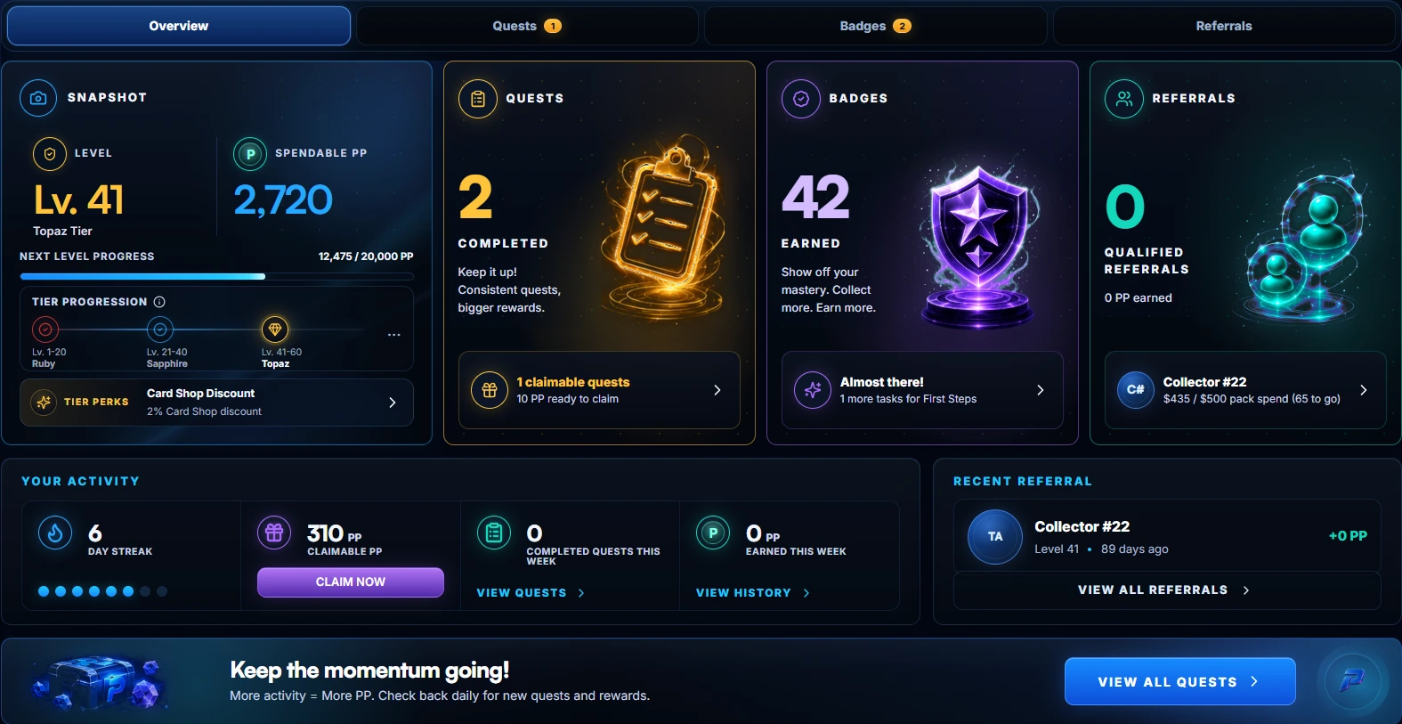
PocketPull / Earn
LAUNCH ACTIVITY
PocketPull’s first month
$600KVolume in the first month
15,000Pack rips in the first month
01 / THE PRODUCT
Turn separate mechanics
into one understandable product.
A pack opening is only one moment. The harder design problem was helping collectors understand how cards, points, quests, rewards, and community participation affect one another.
Each system has its own rules, values, and states. I shaped the experience so collectors can see what changed, what matters now, and what they can do next—without flattening everything into one screen.
HOW THE PARTS CONNECTProduct relationships, rather than conversion data.
01Open & collect
→Start with the cards.
02Make progress
→Quests, badges, and levels.
03Use rewards
→Points and shop benefits.
04Find community
Shared goals through guilds.
FROM CONCEPT TO REQUIREMENTS
Make the product concrete before polishing the screen.
Turn direction into mechanics, rules, states, dependencies, edge cases, and acceptance criteria.
Express the requirements through journeys, hierarchy, interaction, and reusable component behavior.
02 / PROGRESSION
Help collectors see
where they stand.
The Earn overview puts levels, points, quests, badges, and referrals together. I wanted a collector to see their progress without checking several separate pages.
Earn OverviewDESKTOP WEB
Start with their level
Level and next-level progress come first. Individual quests and achievements sit alongside them.
Label what they can spend
“Spendable PP” tells collectors which points are available to use, rather than leaving them to infer that from their level.
Put the action nearby
Collectors can see a claimable reward or an unfinished goal and go straight to it.
03 / REWARDS
Show what
points can buy.
In the Card Shop, collectors can use points for an Origin Pack or a graded card. Prices, tier discounts, and any points shortfall sit beside the item.
Card ShopCompare the desktop and mobile layouts.
Card Shop / DesktopDESKTOP WEB
MOBILE WEBKeep the card
Keep the card
and its price together.
On mobile, the card comes first, with its grade, points price, and shortfall below it. The bottom navigation stays available.
These screenshots show different account states: mobile is signed out; desktop includes a tier discount. That’s why the prices differ.
Worth keeping distinct: points, dollar prices, card values, and tier discounts. Each needs its own label so collectors know what they’re looking at.
04 / PACK OPENING
Open the pack.
See what changed.
Once the card is revealed, the Pull Recap shows what that pull added to points, binder progress, quests, and badges.
PACK OPENING & RECAP17 SEC · SILENT
Pack opening → Card reveal → Pull Recap
Give the card its moment.
The reveal stays focused on the card. Progress updates come afterward in a separate recap.
Show the other updates afterward.
The recap brings the other updates together and includes a link to the relevant binder.
Recorded in the product. Wallet approval, account details, and audio have been removed.
05 / COMMUNITY
Find a guild
that fits.
Guilds give collectors a way to work toward shared goals. Discovery shows each guild’s focus, membership, and activity before someone joins.
Guild DiscoveryDESKTOP WEB
Give people a basis for choosing.
Collectors can filter by collection, sort the results, and compare membership and activity using the same fields on each card.
On mobile, those details stay together in a single-column card.
A DETAIL TO REVISIT
Can someone join a full guild?
This screen says “Open roster” but shows 20/20 members. The copy needs to explain whether people can apply, join a waitlist, or wait for a space.
An open QA item in this version.06 / PRODUCT SYSTEM
A system the product
can grow with.
Across Earn, the Card Shop, pack opening, and guilds, I reuse a small set of interaction and interface rules instead of treating every feature as a separate visual exercise.
Make the next action clear.
Claim, continue, buy, or join stays prominent while supporting context and secondary details remain available without competing.
Keep different values distinct.
Spendable points, dollar prices, card values, shortfalls, and tier discounts are labeled rather than left for collectors to infer.
Let the state explain what follows.
Available, claimable, completed, locked, signed-out, and empty states use repeatable language and hierarchy.
Keep the model; change the composition.
Cards, navigation, modals, and actions reorganize for mobile without changing the underlying product rules.
Why it matters
Shared patterns give engineering clearer implementation rules and make future features easier to extend without inventing new visual language each time.
07 / MOBILE WEB
The same product
on a smaller screen.
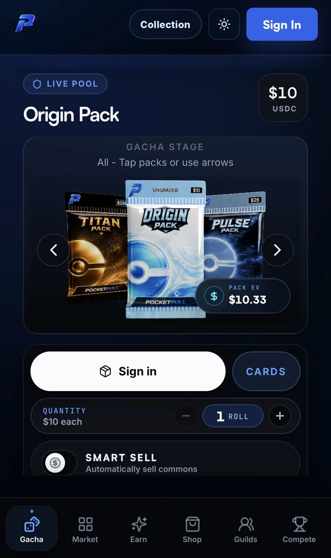
These screens show how the same product model adapts across pack selection, quests, badges, and guilds on mobile web.
Mobile-web screenshots, including signed-out and zero-progress states.
08 / AI-ASSISTED DESIGN & DELIVERY
Use AI for range and speed.
Keep the judgment human.
AI helps me explore more directions and move selected ideas into working software faster. I remain accountable for the problem, the product rules, the interaction, and the quality of the release.
Define the product
I turn the concept into user outcomes, mechanics, requirements, dependencies, states, and acceptance criteria.
Explore more directions
AI helps generate a broader set of visual concepts and implementation approaches quickly.
Choose and refine
I compare hierarchy, interaction, responsive behavior, and fit with the wider product system.
Build and verify
I prototype or implement frontend UI, open pull requests, and test the integrated result with engineering.
AI increases my range and velocity; it does not decide what the product should do or whether the experience is ready. I set the direction, explain the tradeoffs, and work with engineering through data dependencies, edge cases, implementation review, and QA.
What is—and isn’t—shown
These are screenshots and a recording of the implemented product. This version does not yet include earlier design iterations or a redacted pull request, so I have kept those artifacts out rather than reconstructing them as historical evidence.
09 / RESULTS & NEXT STEPS
The first month,
and what comes next.
PocketPull recorded $600,000 in volume and 15,000 pack rips in its first month.
Beyond that first month, I’d look at how often collectors return, whether they understand their progress after a pull, and how they move from earning points to using them. I’d also keep reviewing the signed-out, empty, loading, and error states.
WHAT I’D MEASURE NEXT
Repeat pack opening, return visits, and points redemption. First-month activity gives us a starting point; it doesn’t tell us how those habits develop.